What is a CTA?
A Call To Action is the nudge you give potential customers towards taking an “action” on your ad or page. From a simple “Learn More” to a more elaborate “Avail Trial Offer” – the perfect CTA can help your campaign succeed.
Here, you can learn everything you need about the perfect CTA. From how to grab and sustain customers’ attention, to what CTAs you could use based on the purpose of your ad, placement, color and more – make notes as you go along.
KYC
Know your customer first. To make sure you’ve got all your bases covered, follow AIDA. First, get the Attention of your customers. Once you’ve attracted them to your ad, you’ve got to sustain their Interest in what you are saying. Then, convert this interest into a Desire for what you have to sell. Here’s when you push them, with the perfect CTA, into taking the Action that will result in a conversion for you!
Purpose
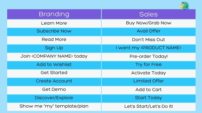
What do you want to do for your customers when they click on your CTA button? If you aren’t selling anything, but want them to know and trust your brand, you use more “informative” CTAs. On the other hand, if you are selling, the perfect CTA to use us one that is urgent and compelling.
As humans, we tend to follow orders rather than requests. This is why a “Please click here to learn more” doesn’t work as well as a “Learn More.” As social beings, we also crave exclusivity and experience FOMO or the Fear of Missing Out. This explains why CTAs like “Grab Offer,” “Pre Order,” or “Join exclusive trial” make us tap and double-tap!
Here’s a list of 24 perfect CTAs you can use depending on your requirement.
Color
You want your CTA button to grab attention from the time people land on your page or ad. The colors you use for the button and the text on it can range from brand-compliant to contrasting. While orange or red buttons have worked well for many brands since they provide a sense of urgency, it’s always good to A-B test for yourself, and learn the color of your perfect CTA button. White and black are the most common font colors used, so you need to remember to keep the font as well as color simple, distinctive, and easy to read.
Placement
Where your CTA button is placed is very important, because you don’t want your customers to have to hunt for it (Pro-tip: They won’t hunt, they’ll just drop off). First, you need to be upfront about what action you want them to take. Then, ensure the button has negative or white space around it so that it stands out clearly.
There have been many debates about below-fold or above-fold, which is basically whether the customer should be able to see the button without scrolling even once, or at the end of the page. However, nowadays, customer behavior doesn’t make it easy to come up with a rule of thumb. So your perfect CTA should be up-front and then strategic placements through the landing page.
Design rules talk about the Gutenberg, Z, and F layouts of text on a page. To simplify these, they’re basically talking about how a person scans a page with content and design and is most likely to get their attention. You can take a look at these formats here, but to cut to the chase, you will always want to place your CTA on the right of the page.
Finally, you need to remember that the perfect CTA is consistent and single. The same CTA through the page plays on the audience’s memory and encourages them to click on the button. If you want a line of supporting text with your CTA, you could give it a try, like “Sign up Now” and “Free for first 500 folks”. Don’t make it a practice across all your campaigns, however.
Now you know what can help convert your customers, try to find the perfect CTA for every campaign. If you are stuck at creating the ideal post for any social media channel, take a look at these posts. Have any questions? Shoot them to us on our social networks below, and we’ll work it out with you!


